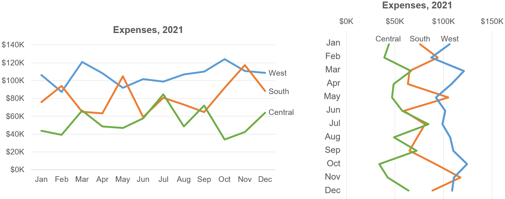
I recently asked dataviz Twitter if there were situations in which a vertical line chart was the truly best choice. I was skeptical at first, but they changed my mind, so I wrote up the thought process as a Nightingale article for those who may be considering using vertical line charts in their own work.
Read moreAre line charts liars?
When I show line charts in my Practical Charts workshops, participants sometimes express concern that line charts “hide values that occur in between the points on the line”. In this article, I argue that this is a misconception and that line charts of summary values (e.g., monthly totals) don’t hide meaningful information.
Read moreHow many bins should my histogram have?
Choosing how many bins to include in a histogram can be a tricky design decision. There are many articles out there that recommend algorithms or rules of thumb for calculating the “optimal” number of bins, however, I don’t think that any calculation can do this reliably. In this post, I argue that the “optimal” number of bins depends mostly on the specific insight that needs to be communicated about the data, and not on the nature of the data (number of values, standard deviation of the values, etc.)
Read moreLet's Make a Map of the Data Visualization Field!
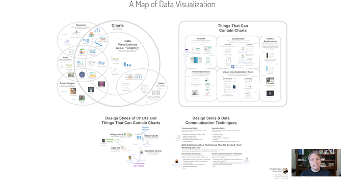
I love data visualization but, TBH, the field is a bit of a mess and can be overwhelming and unapproachable, especially for beginners. In an effort to bring a bit of order to the chaos, I've been working on a "map" that brings many dataviz-related terms, types of visuals, skills, software products and books together into a single graphic that attempts to show how they all relate to one another, and to make the field more approachable.
Why the NYT Spiral Graph Is a Failure. And a Success.
A recent The New York Times graph showed COVID case counts in the U.S. since the beginning of the pandemic in a spiral chart. This chart basically burned data viz Twitter to the ground, with everyone and their dog either praising or trashing it. I think that a crucial element was missing from most of the debates, though, which I discuss in this article.
Read moreDoes Data Visualization Have Rules? Or Is It All Just “It Depends”?
In the data visualization community, there are those who believe that there are universal rules such as “Never use pie charts”, or, “Always include zero in a chart’s scale”, and then there are those who believe that there are no universal rules that apply in all situations, only general principles that must be adapted to the specific situation at hand based on judgment and experience. I propose a third possibility, which is that many common dataviz design decisions can be codified as formal rules that apply in all situations, it’s just that those rules tend to be too complex to be expressed as single sentences. They can, however, be expressed as relatively simple decision trees that can reliably guide practitioners of any experience level to the best design choice.
Read moreDo I need to include zero in my chart’s scale? (It’s surprisingly complicated…)
Chart creators often extend the quantitative scale in their charts to include zero when it’s not necessary, or don’t extend it to zero when it is necessary. Making the wrong design choice can make charts hard to read, distort readers’ perception of the data, or hide key insights. Expert opinions differ on when it is and isn’t necessary to extend a chart’s scale to zero, but most of the opinions that I’ve seen are, I think, too simplistic. Determining when zero is or isn’t necessary is surprisingly complex and multi-factorial (hence this 4,600-word article), but it can be captured as a decision tree of rules that chart designers of any experience level can follow to guide them to the right choice in any situation. Feel like coming down the rabbit hole with me to find out what are all of the factors that affect this decision?
Read moreThe biggest misconception in data visualization
When designing a chart, most people try to come up with the ‘best way to visualize the data’. This often results in charts that are unobvious or useless to readers, though. Instead, we should try to design charts that best answer a specific question or that best communicate a specific insight about the data, even though such charts don’t answer all questions that readers might have about the data.
Read moreI’ve Stopped Using Box Plots. Should You?
I've recently published an article in the Data Visualization Society's excellent Nightingale publication, entitled "I've Stopped Using Box Plots. Should You?" A brief summary:
After having explained how to read box plots to thousands of workshop participants, I now believe that they’re poorly conceived (box plots, not workshop participants ;-) ), which makes this classic chart type unnecessarily unintuitive, hard to grasp, and prone to misinterpretation. This has caused innumerable distribution-based insights to fail to land with audiences who weren’t willing or able to grasp them. Alternative chart types are virtually always easier to learn how to read, more informative, or both.
Want to read the full, heretical article? It's now available on the Nightingale site.
Read moreThe two completely different chart types that are called "scatterplots"
Should you label the individual dots in a scatterplot? Should you add a trendline? Should you divide the chart area into quadrants? The answers to these—and most other scatterplot design best practice questions—depend on which type of scatterplot you’re designing; a “correlation scatterplot”, or an “item-comparison scatterplot”.
Read moreWhy “% deviation from trailing average” indicators on dashboards aren’t helpful (book excerpt)
As I’ve discussed in a previous blog post, a dashboard that doesn’t visually flag metrics that require attention will likely flop with users. In fact, the lack of such indicators could be the number one reason why so many dashboards fail to deliver acceptable levels of user satisfaction and traction.
While not as common on dashboards as other flagging methods, participants in my Practical Dashboards workshops often ask about “% deviation from trailing average”, so I’ve written this post to illustrate why that method actually isn’t much better than the more common alternatives.
Read moreWhy are so many beautiful charts also bad?
Many of the charts that I see being passed around on social media because they’re confusing or misleading are also beautiful. They seem to have been created by people with great graphic design skills, but who’ve had little or no training in data visualization. Such designers may have been taught that "a visually engaging or aesthetically pleasing design is a good design" since this is certainly true for most types of graphics, but they don’t seem to fully realize that charts are a special type of graphic with a slew of additional design considerations beyond just aesthetic appeal.
Read moreMy dashboard users don’t even know what they want!
Dashboard designers often complain that “my users don’t even know what they want”. This isn’t a reasonable complaint, though, since it requires a great deal of skill to figure out what type of information displays will be most helpful to users, and we can’t expect users to have those skills. We, as dashboard designers, have to bring those skills to the table.
Read moreRemembering Charles Assey
In the before-times, I taught workshops in over a dozen countries and, without a doubt, the most interesting and beautiful one was Tanzania. Those workshops were organized by Charles Assey, a management consultant and senior advisor at the Bank of Tanzania.
Charles passed away on June 11th from a long-term illness. This news hit me quite hard since Charles was one of the most remarkable people that I’ve ever met. More than just a brilliant management consultant, Charles had an almost shocking amount of integrity and was one of those rare people who had both the ability and the genuine desire to make the world a better place. This is probably why he was well-connected and admired among global experts in reporting and performance measurement.
Charles always had the courage and selflessness to downplay his illness and deflect any concern about it, and it was devastating to learn that it caught up with him. In a year with so many losses, this one stands out as particularly painful and unfair.
The (Scary) Power of Data Storytelling
Much has been written in recent years about how powerful data storytelling can be, and that’s certainly true. As the saying goes, though, with great power comes great responsibility. Someone who’s great at storytelling is, almost by definition, also great at suppressing the audience’s ability to think critically about what they’re hearing. If we get carried away and start crafting the data around the story instead of the other way around, great storytelling makes that harder for audiences to notice.
Read moreWhat, exactly, makes one chart better than another?
When people disagree on whether one chart design is better or worse than another, they often have quite different assumptions about what “better” actually means when it comes to charts. Depending on the person, “better” could variously mean more precise, more creative, more familiar, faster to visually process, more inspiring, more neutral, more versatile, more memorable, or any one of several other quite distinct definitions. Agreeing on a common definition of “better” will allow the data viz field to move past some longstanding controversies and make it much easier for novices to learn how to create truly useful charts.
Read moreWhy a dashboard on its own won’t improve performance
A short video interview with performance measurement and improvement expert Louise Watson, in which she explains why a dashboard on its own won’t improve organizational performance. We also cover some of the common bad practices that torpedo performance improvement initiatives, as well as key elements that are required beyond just having a dashboard. Some absolute gems for anyone who’s ever struggled with how to choose the right KPIs.
Read moreHighlight “obviously wrong” values on dashboards!
Because errors do happen, our dashboards will sometimes contain “obviously wrong” metric values, such as a “Customer Satisfaction Rating” of 12.5 on 10, or a “Manufacturing Defect Rate” of -14%. It’s essential that our dashboards be “smart” enough to detect such obviously wrong values so that we can visually flag them as incorrect on the dashboard. If we don’t flag obviously wrong values, users will likely notice them anyway, putting the accuracy of every other value on the dashboard into question.
Read moreThe problem with slope charts
Slope charts and other common ways of showing “before and after” data are almost always misleading. Using a “merged arrow chart” eliminates the risk of misleading readers.
Read moreHow to hire a data visualization pro (or become one)
Organizations often ask me how to hire people who can create better charts for their decision-makers and this post summarizes my (current) answer to that question. While this post is written as a guide for employers, it can, of course, also act as a guide for those who want to become data visualization professionals themselves and work for the organizations that so urgently need those skills.
Read more


