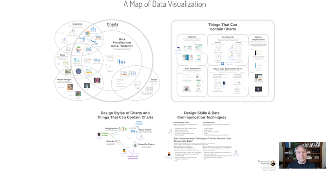
I love data visualization but, TBH, the field is a bit of a mess and can be overwhelming and unapproachable, especially for beginners:
There's a dizzying variety of visuals that people call "data visualizations" (maps, data art, scientific charts, etc.), each of which require very different skills to create.
Data visualization can serve many different purposes, from status monitoring, to entertainment, to data analysis, to persuasion and advertising.
There are hundreds of books and software products available, each of which deals with different types of visualizations and purposes of visualization.
Experts use basic terms like "dashboard", "data storytelling", "report", "infograghic", etc. differently.
In an effort to bring a bit of order to the chaos, I've been working on a "map" that brings all of these terms, types of visuals, skills, software products and books together into a single graphic that attempts to show how they all relate to one another, and to make the field more approachable.
The current version of the map is a draft so please comment! Use the hashtag #mapofdataviz on Twitter or LinkedIn if you have ideas or suggestions for improvement:
Interactive online map: https://mapofdatavisualization.com/
"Guided tour" video (36 mins): https://youtu.be/4InqklhiwTk
Nightingale article that introduces the map: https://nightingaledvs.com/a-map-of-data-visualization-please-comment/
Special thanks to these smart people, who created books and courses that are mentioned in the map or made suggestions to improve it (so far...): Stacey Barr, Lizanne Béïque, BPharm, PharmD, Nadieh Bremer, Andy Cotgreave, Brent Dykes, Ann K. Emery, Xan Gregg, David McCandless, Cole Nussbaumer Knaflic, Bryan Pierce, Jeffrey Shaffer, Cédric Scherer
By the way...
If you’re interested in attending my Practical Charts or Practical Dashboards course, here’s a list of my upcoming open-registration workshops.

