When should you use a bar chart instead of another chart type? Easy question, right? After all, bar charts might just be the simplest (and most common) chart type on the planet.
If you look to the many chart-type-chooser diagrams and chart type catalogs floating around online, you’ll typically see guidelines like…
“Use a bar chart when you need to feature a comparison relationship.”
This sounds reasonable, but the minute you put two or more values in a chart, you’re automatically featuring a comparison relationship, e.g., a comparison of values from different time periods, a comparison of the parts of a total, a comparison of values in different parts of a distribution, etc. Basically, all charts feature comparison relationships of one type or another, so, if you follow this guideline, all of your charts would be bar charts.
…or…
“Use a bar chart when you need to compare categories with one another.”
This also sounds reasonable until you realize that most chart types compare categories with one another, including line charts, heatmaps, pie charts, choropleth maps, arrow charts, scatterplots, and many, many others. If you follow this guideline, then, once again, most of your charts would be bar charts.
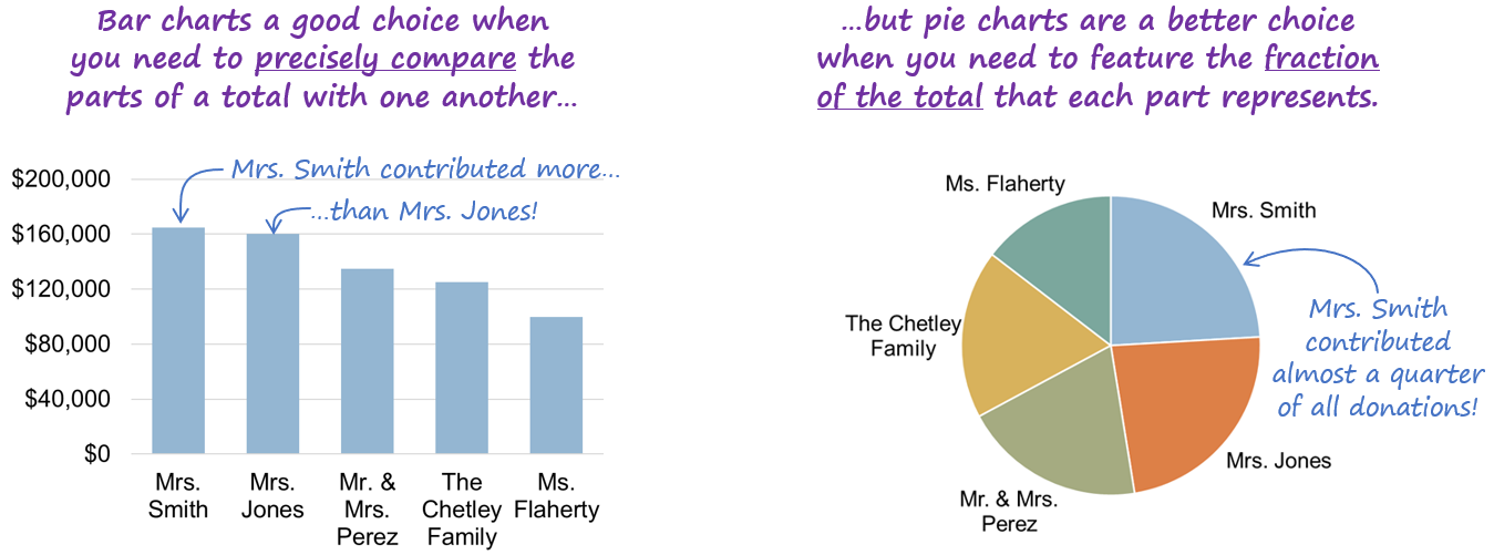
Clearly, all of your charts shouldn’t be bar charts, so what’s going on here? Well, bar charts are actually unique among chart types because they’re the only chart type that can show virtually any kind of data:
Because bar charts could be used to show any kind of data, does that mean that all charts should be bar charts? Well, no, as you can probably guess, there are good reasons to use other chart types in many situations, for example…
…and I could show dozens more examples of situations in which the choice between using a bar chart and another chart type depends on the specific purpose of the chart, the number of values to be shown, and a variety of other factors.
For example, the decision tree below from my Practical Charts course provides guidance on when to use a bar chart instead of another breakdown-of-total chart type such as a pie chart, waterfall chart, stacked bar chart, Pareto chart, or treemap. (Note that this decision tree isn’t intended to be self-explanatory; I’m just showing it here to illustrate that this kind of decision-making isn’t as simple as many people think it is.)
…and there are seven other, similar decision trees in the Practical Charts course for choosing a chart type to show data over time, distributions of values, values with locations, etc.
As it turns out, then, choosing when to use a bar chart or another chart type is surprisingly complex. In fact, I’d argue that, in a way, bar charts are actually the most complex chart type, because in order to know when to use a bar chart, you have to know when to use virtually every other chart type.
Weird, right?
BTW…
If you’re interested in attending my Practical Charts or Practical Dashboards course, here’s a list of my upcoming open-registration workshops.
To be notified of articles like this in the future, subscribe to Nick’s email list (one to four emails per month to level up your dataviz and dashboard design skills).


