tl;dr: Many chart creators assume that choosing a chart type is an easy decision that can be made using simple rules of thumb like, "Use line charts to show data over time." Unfortunately, these rules of thumb are too simplistic and often lead to poor chart type choices, and making a good chart type choice usually requires taking at least six or eight factors into consideration.
Before taking my Practical Charts course, workshop participants often assume that choosing a chart type is a pretty straightforward decision. While I certainly wish it were straightforward, the harsh reality is that it’s surprisingly complicated, even for simple chart types like line, bar and pie charts. That’s why about 8 of Practical Charts’ 14 hours of course time are spent on chart type selection, despite the fact that only a few dozen common chart types are covered.
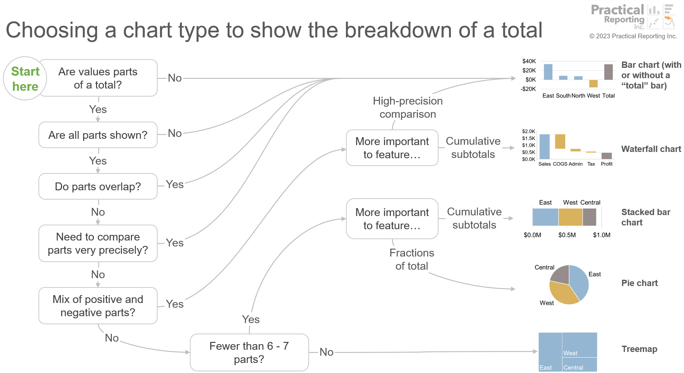
When choosing a chart type, it’s usually necessary to take six, seven or even ten decision factors into account. For example, the decision tree below from Practical Charts shows the eight factors that need to be taken into account when choosing a chart type to show the breakdown of a total:
…and there are eight more decision trees like this in the course for choosing a chart type to show values over time, the breakdown of a total over time, values with locations (maps), etc.
Since most chart creators underestimate how tricky it is to make a good chart type choice, they often have a number of misconceptions about the process. What are those misconceptions? I’m glad I assumed that you asked…
1. Simple rules of thumb work just fine.
“When showing values over time, use a line chart.”
“When showing the breakdown of a total, use a pie chart.”
“When showing the breakdowns of several totals, use a stacked bar chart.”
These all sound reasonable, but do they actually work in practice? Let’s put that first rule of thumb to the test: Should you always use a line chart to show values over time?
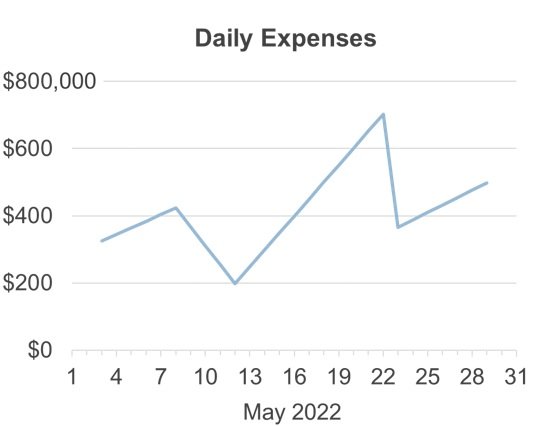
How about in this situation, when we experienced a catastrophic data loss and lost 25 of the last 31 “Daily Expense” values?
As a standard line chart, it looks like we know how Expenses changed during this time, but the reality is that we’re missing values for far too many days to know what the actual pattern of change was. In order to avoid showing patterns that don’t actually exist, then, we’d need to use a dot plot instead of a standard line chart:
How about in this situation, when we’re showing the price of a TV model changing over time?
This standard line chart is actually pretty misleading, since it makes it look like, for example, this TV had a price at the beginning of April ($400), but then no price until the end of April ($350), even though, in reality, the TV had a price of $400 that whole time. Worse yet, some chart readers might think that the price steadily declined from $400 at the beginning of April to $350 at the end of April, which is definitely not what happened.
In order to show this data accurately, a step chart would be needed, since it accurately represents values that can occur at irregular intervals of time and that “persist” until the next value occurs, such as a product’s price over time:
There are also situations in which a bar chart, bumps chart, or heatmap would be a better choice than a standard line chart.
Therefore, “Always use a standard line chart to show values over time” is problematically over-simplistic and will frequently lead to bad chart type choices. Choosing a chart type always requires taking a variety of factors into account that can’t be captured in simple rules of thumb. They can, however, be captured in decision trees, such as the “breakdown of a total” one that I showed earlier.
2. Some chart types are better than others, so just choose the better chart types.
Some chart types might be the best choice more often than others, but that doesn’t mean that they’re better chart types. For example, as we just saw, standard line charts are most often the best choice to show data over time, but there are plenty of situations in which dot plots, step charts, bar charts or other chart types are better choices than standard line charts. None of those chart types are “better” or “worse” than any other; each of them is the best choice in different situations, and the trick is to know when to use each.
I think of chart types as the “vocabulary words” of data visualization. Like the vocabulary of any other language, it makes sense to use certain words in certain situations and not others, but that doesn’t make certain words “better” than others. Therefore, saying something like, “Stacked bar charts are better than clustered bar charts” is like saying, “The word ‘car’ is better than the word ‘house.’” Neither word is “better,” it just makes sense to use each word in different situations.
Now, having said that, I do think that there are about a dozen chart types that are virtually never the best choice, including box plots, bullet graphs, radar graphs, connected scatter plots and a few others. Outside of those, however, I don’t think any chart type is better or worse than any other.
3. Just choose chart types that the audience prefers.
While the audience might, for example, prefer standard line charts over dots plots or step charts, if you always use standard line charts to show data over time, you’ll inevitably end up confusing or misleading your audience. When it comes to choosing a chart type, then, the customer isn’t always right (unless they’re data visualization experts themselves).
4. You only need a handful of chart types for everyday reports and presentations.
That’s like saying that you only need a handful of words to write effectively. If you limit yourself to, say, a few dozen words, your writing will be confusing at best and misleading at worst. The same thing will happen if you only ever use, say, five or ten chart types.
In my experience, about 30 chart types are needed to communicate effectively to audiences with an average level of data savviness, such as non-technical executives or mainstream news media audiences. For more data-savvy audiences who can grasp more “advanced” chart types such as scatter plots or histograms, the number of chart types needed jumps to about 50. For domain specialists like cartographers or mathematicians, that number could reach 100 or more.
To create effective charts, then, I think at least 30 chart types need to be in your “chart type vocabulary.”
5. Dataviz software can make good chart type choices automatically.
I wish. Unfortunately, however, software products like Microsoft Excel or Tableau Desktop either don’t recommend specific chart types, or the default chart types that they do recommend are questionable at best. This isn’t their fault, however, since factors such as the purpose of the chart (the specific question to answer, the specific action you want the audience to take, etc.) and the level of data-savviness of the audience are major considerations in chart type selection, and the software generally isn’t aware of those considerations.
Having said that, I do think that there are opportunities for dataviz software products to offer more guidance than they currently do to help users make good chart type choices. I also suspect that recent breakthroughs in AI will be helpful in this area, although my guess is that humans with data visualization expertise will still be needed for the foreseeable future.
6. Simple “chart-chooser” diagrams or tools work just fine.
Yes, there are plenty of simple “chart chooser” diagrams floating around online, but, in my not-so-humble opinion, they’re all problematically oversimplistic. They’re essentially graphical versions of the simple-but-problematic rules of thumb that we saw earlier.
I’m currently experimenting with combining all eight decision trees in Practical Charts into a single “master decision tree” that includes about 50 chart types, and this is what it looks like currently:
Sorry that I can’t provide a high-res version at the moment—it’s not fully baked yet. I’m just showing it here to illustrate that, IMO, a “chart-chooser” diagram needs to be much more complex than the simple ones that I see floating around online in order to make reliable chart type recommendations.
7. Making a less-than-ideal chart type choice isn’t the end of the world.
Many people assume that it doesn’t make much of a difference whether data is shown as a line chart, bar chart, heatmap, or any other chart type. Using the wrong chart type in a chart, however, is like using the wrong doorknob in a sentence. As I hope the examples in this article illustrate, a poor chart type choice can—and usually will—confuse audiences or pose a high risk of misrepresenting the data, so it’s important to master this skill in order to create charts that are clear, compelling, and accurate.
By the way…
If you’re interested in attending my Practical Charts or Practical Dashboards course, here’s a list of my upcoming open-registration workshops.


