
This excerpt from my upcoming book, Practical Dashboards, is the third in an eight-part series on how to determine which metrics to visually flag on a dashboard (i.e., with alert dots, different-colored text, etc.) in order to draw attention to metrics that require it. In this post, I look at the “vs. previous period” method of flagging dashboard metrics and why, despite being extremely common, this method for drawing attention to metrics can be worse than useless. In a later post in this series, I’ll introduce a more useful approach called “four-threshold” visual flags.
Read morePerformance targets aren’t the same as alert thresholds (book excerpt)
This excerpt from my upcoming book, Practical Dashboards, is the second in an eight-part series of posts on how to determine which metrics to visually flag on a dashboard (i.e., with alert dots or different-colored text) in order to draw attention to metrics that require it. Determining when to flag or not flag metrics on a dashboard can be a messy process within organizations because people often disagree about what should be considered “good” or “bad” ranges for a given metric. There’s another, less obvious cause of controversy in such discussions, though, which is that people often talk about two very different types of flagging criteria without realizing it: criteria for indicating when action is required and criteria for indicating whether a metric is performing well or not. While these might sound similar, their fundamental purposes and the ways that we go about setting them are very different.
Read moreInclude visual flags on dashboards!!! (book excerpt)
This excerpt from my upcoming book, Practical Dashboards, is the first in a eight-part series of posts on how to determine which metrics to visually flag on a dashboard (i.e., with alert dots, different-colored text, etc.) in order to draw attention to metrics that require it. In this post, I briefly discuss why visual flags are almost essential in order for dashboards to deliver the user traction, satisfaction and value that organizations hope for and expect, and why a lack of visual flags has contributed to the failure of many dashboards.
Read moreStop trying to create “general purpose” charts (because they don’t exist)
I frequently encounter the misconception that, for a given set of data, it’s possible to design a chart that will be useful regardless of the audience or the reason why that audience might need to see that data. Such “general purpose” charts don’t exist, though, since any visualization of a given data set will inevitably serve some audiences and purposes well and others not. In order to create a useful chart, then, the target audience and reason(s) why that audience needs to see that data must be identified beforehand.
Read moreArtistically impressive doesn't equal informative
People often assume that beautiful, artistically impressive charts are highly informative, but they’re usually far less informative than simple, “boring” charts. If we consider such charts to be “data art,” then there’s no issue with them because their main purpose isn’t to be informative. But if, as many people do, we consider them to be “informative” charts, they tend to perform far worse than simple, artistically unimpressive charts.
Read moreVideo: Why dashboards for Problem Scanning AND performance monitoring don’t work
I’ve seen a lot of dashboards that failed to meet users’ and organizations’ expectations. There are a variety of reasons why this happens and, in this video and post, I focus on one of the most common ones, which is that the people who designed the dashboard didn’t fully understand the distinction between problem scanning and performance monitoring. When this happens, the dashboards that they end up designing don’t fulfill either of these needs well. This video and post are based on a chapter from my upcoming book, Practical Dashboards.
Read moreA graph redesign
I came across this recent post on Cole Nussbaumer Knaflic’s popular and highly worthwhile blog, wherein Cole proposes three redesigns of a less-than-optimal graph that a client of hers had created. I wanted to propose another, alternative redesign but, as with most blogs (including this one), I couldn’t embed an image of my redesign in a comment on her blog, so I’m posting it here instead. To understand the context and purpose of my redesign, and for the rest of this post to make any sense at all, you’ll need to read her post first. Don’t worry, I’ll wait here.
Back? Great. So, my redesign looks like this:
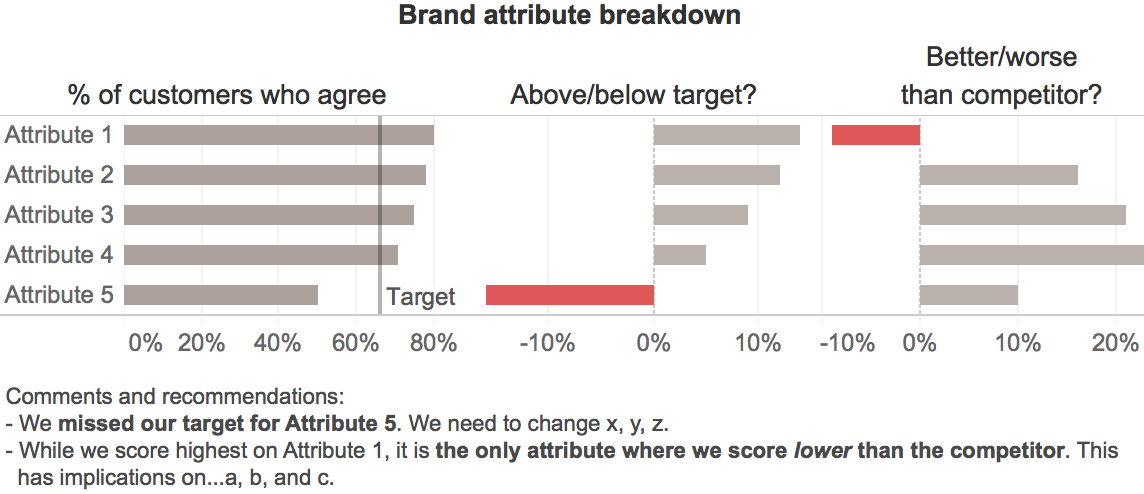
The main reason for this redesign was that I saw an opportunity to make the key message of the chart more visually salient and obvious. As per Cole’s description, the main message that we want to convey is that our company has two problems:
- We’ve fallen short of our target for one attribute (Attribute 5).
- Customers are rating us as worse than our competitor for one attribute (Attribute 1).
With this redesign, I think that these key messages will be understood more quickly and with less cognitive effort since much of the initial work required to interpret this graph will be done by users' unconscious visual systems, which generally begin by interpreting graphical elements before text. If we suppress the text, we can see that the key messages and many aspects of the basic structure of the data are communicated by the graphical elements alone:

Within the first second or so, and before the reader has read any text or started to consciously think about what they’re seeing, they’ll probably grasp the following basic information in roughly the following order:
- There are two problems, i.e., the two red objects. It's good that these are the most noticeable elements in the graph since they're our main message.
- Those two problems are problems because they extend to the left (i.e., are negative) while all of the other values in their respective groups extend to the right (i.e., are positive), which is an important element of the main message.
- The data consists five items (the rows), each of which has three values associated with it (the columns), i.e., the basic structure is immediately obvious.
- The items are sorted from largest to smallest, based on whatever variable is represented in the left-hand column of bars.
As the viewer starts to read the text labels, the additional understanding that those labels provide (i.e., that the data are measures of how customers feel about our company's attributes, that those measures are being compared with internal targets and responses to a competitor, etc.) falls nicely into the basic --but accurate-- framework of understanding that’s been set up by the graphical elements. This, in turn, enables what I’m guessing would be rapid and cognitively easy visual consumption and quick understanding of the key messages, though only a well-designed user test would be able to determine this with confidence.
As with almost any design, there are, of course, trade-offs. In this case, the main one is that the actual “% of customers agree” values for the competitor aren’t shown, only the differences between those values and those for our company. That was a judgment call that I made based on the assumption that the audience would care more about the differences between our company and our competitor as opposed to the actual values for the competitor, but that assumption may not be valid.
What do you think? Can you see any other problems with this redesign or can you think of a better one? If so, please pipe up in the comments.
New book coming in 2020: "Practical Dashboards" – feedback needed!
Despite the fact that books and courses on information dashboard design have been available for years, many dashboards still fail to meet users’ and organizations’ expectations. Users have trouble finding answers to basic data-related questions and fail to notice urgent problems because they aren’t obvious (or possibly even displayed) on dashboards. Because of these and other issues, many dashboards end up under-used or even abandoned. Based on Nick Desbarats’ experiences designing dashboards for over 50 organizations, Practical Dashboards uncovers the real reasons why so many dashboards end up disappointing users and organizations; reasons that go far deeper than the visual design on which most dashboard books and courses focus. Readers will learn a practical, actionable framework for creating a set of purpose-specific information displays that enable users to quickly and accurately answer their data-related questions, including fundamental ones such as, “Is everything O.K. at the moment?” often for the first time.
Read moreDeep dive: Visualizing wide-variation data
In March 2016, I guest-wrote Stephen Few's popular quarterly VIsual Business Intelligence Newsletter. The topic was one that came up often enough in training workshops to merit a longer write-up (i.e., a "deep dive"): how to visualize data sets that include a combination of very small values (i.e., close to zero) and very large values (i.e., far from zero). Creating a standard line or bar chart based on such data sets yields bars or lines that are too small to visually estimate or accurately compare with one another, so the newsletter suggests some creative solutions to address this common challenge.
Read moreMindware: Tools for Smart Thinking (book review)
Richard Nisbett's Mindware: Tools for Smart Thinking should be required reading for every university student (or anyone else who wants to make fewer reasoning errors). The book consists of an eclectic but extremely practical collection of "tools for smart thinking", covering concepts as varied as the sunk cost fallacy, confirmation bias, the law of large numbers, the endowment effect, and multiple regression analysis, among many others.
Read moreDo tooltips reduce the need for precision in graphs?
In many modern data visualization software applications, users can hover their cursor or finger over any bar, dot, box, line, etc. to see the exact, textual value(s) of each element. Since this allows users to see exact values whenever they need to know them, does this mean that graph designers no longer need to worry about how precisely values in their graphs can be estimated visually (i.e., without seeing a tooltip)?
Read moreAvoiding quantitative scales that make graphs hard to read
Every so often, I come across a graph with a quantitative scale that's confusing or unnecessarily difficult to use when visually estimating values in the graph. In this post, I propose simple guidelines for data visualization software developers to follow to ensure that the default quantitative scales that their products generate make it easy for audiences to "eyeball" values in the graph easily and accurately.
Read more